> ## Documentation Index
> Fetch the complete documentation index at: https://docs.nuon.co/llms.txt
> Use this file to discover all available pages before exploring further.
# Programmable READMEs
> READMEs that render each install's live values and embed real-time dashboard components.
For static formatting, see [Using READMEs](/guides/using-readmes).
## Variables
READMEs support variables, rendered server-side per install (the same as
component and action fields). Use them to surface install info and keep the
README in sync with the app:
```toml metadata.toml theme={null}
# metadata
name = "My App"
readme = """
# {{.nuon.app.name}}
This is the README for {{.nuon.app.name}} in install {{.nuon.install.name}}.
## Sandbox
This app uses the {{.nuon.sandbox.type}} sandbox.
## Components
This app consists of the following components.
- api
- deployment
```
Variables use [Go templating](https://pkg.go.dev/text/template), so you get
conditionals, ranges, and functions. Here, live component statuses:
```toml metadata.toml theme={null}
# metadata
name = "My App"
readme = """
# {{.nuon.app.name}}
This is the README for {{.nuon.app.name}} in install {{.nuon.install.name}}.
## Sandbox
This app uses the {{.nuon.sandbox.type}} sandbox.
## Components
{{ if .nuon.components }}
This install is running the following app components.
| Name | Status |
|------|------|
{{- range $name, $component := .nuon.components }}
| `{{ $name }}` | `{{ $component.status }}` |
{{- end }}
{{ else }}
__No app components are active in this install. You may need to run "Deploy Components" for this install.__
{{ end }}
```
The dashboard polls the control plane, so component statuses update in
near-real-time.
`.nuon.components` is a map keyed by component name. Iterate it directly with
`range`. Each value carries that component's fields (`status`, `outputs`, etc.).
Unlike `.nuon.sandbox` or `.nuon.install_stack`, it has no top-level
`populated` flag, so use `{{ if .nuon.components }}` to check whether any
components exist.
## Live data components
These `` tags render live install data from the dashboard. They require
install context. When viewed at the app level (before selecting an install),
they render as inline code showing the raw tag.
### Config graph
Shows the install's dependency graph of components and infrastructure.
```markdown README.md theme={null}
```
### View state
Renders a button that opens the install state viewer.
```markdown README.md theme={null}
```
### Runner card
Shows the status card for the install's runner.
```markdown README.md theme={null}
```
### Sandbox card
Shows the status card for the install's sandbox.
```markdown README.md theme={null}
```
### Component card
Shows the status card for a specific component. Reference by `name` or `id`.
```markdown README.md theme={null}
```
Attributes: `name`, `id`.
### Stack card
Shows the status card for the install's stack (grouped deploy history).
```markdown README.md theme={null}
```
### Action card
Shows the status card for a specific action. Reference by `name` or `id`.
```markdown README.md theme={null}
```
Attributes: `name`, `id`.
### Run runbook
Renders a card with a button that opens the run runbook confirmation modal.
Reference a [runbook](/guides/runbooks) by `name` or `id`.
```markdown README.md theme={null}
```
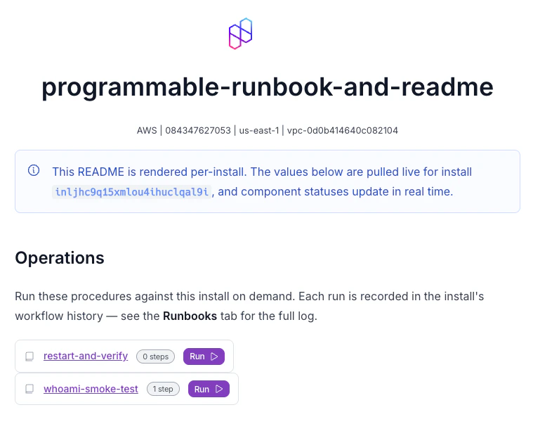
The card shows the runbook name (linked to its detail page), the number of
steps, and a run button. Clicking the button opens a confirmation modal listing
the steps before executing.
Attributes: `name`, `id`.
Live data components are most useful in the referenced `README.md` file format,
where you can build rich install dashboards combining live status cards with
documentation.
## A complete example
For a runnable example, see the
[`programmable-runbook-and-readme`](https://github.com/nuonco/example-app-configs/tree/main/programmable-runbook-and-readme)
app config in `example-app-configs`. It has a per-install app README plus runbook
READMEs that render live values and embed runnable runbooks.